Cliffable Brand Design
This project documents the design of the Cliffable brand, including naming, logo creation, visual identity and a minimal portfolio website for presenting AWS architecture projects.
Context
This project focused on creating a clear, minimal brand for a portfolio of real-world AWS architecture projects.
The name Cliffable is a light play on modern tech naming conventions (e.g. Audible, Remarkable) and works as a flexible label — “Is this project Cliffable?”
It was also chosen with the option of becoming a future business name.
Live system: cliffable.com
Key constraints:
- No cliché cloud or tech visuals
- Must scale across favicon, logo, and website
- Simple, clean design aligned with engineering aesthetics
Architecture
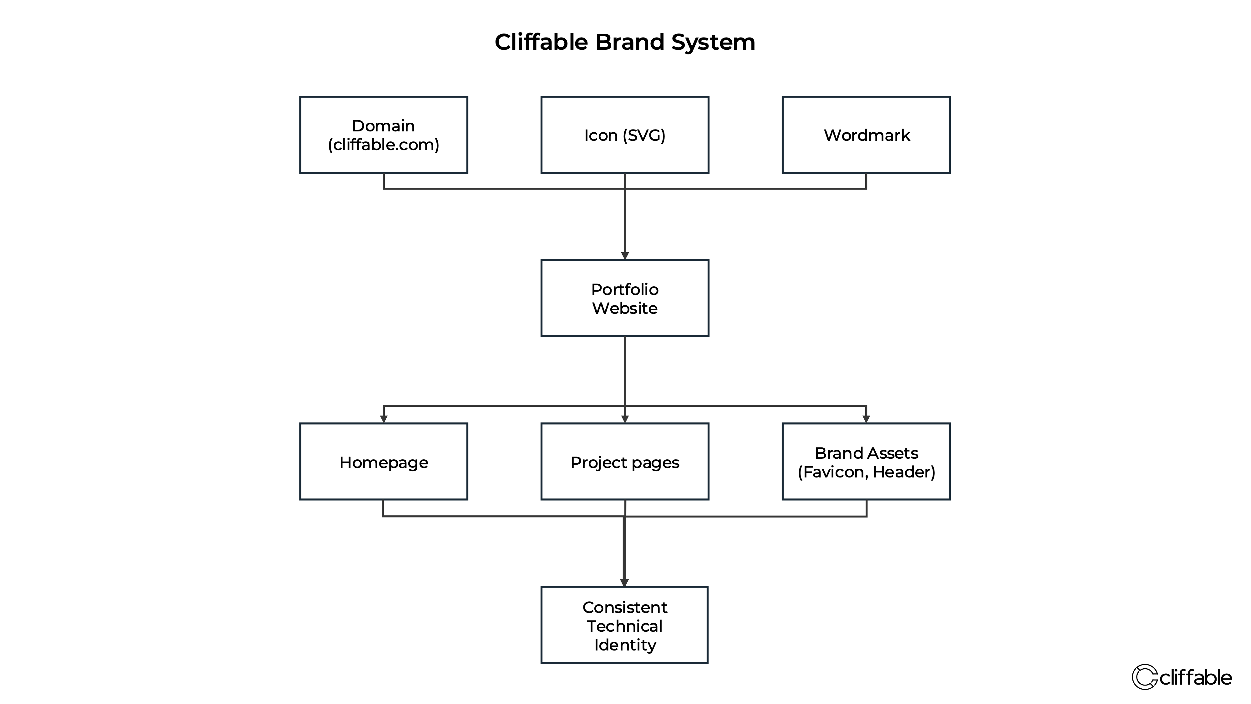
The brand was designed as a system rather than a single logo — combining naming, visual identity, and website structure into a consistent framework for presenting technical work.
Key Decisions
Minimal geometric icon
Why: Creates a clean, technical aesthetic and avoids generic cloud branding
Trade-off: Less immediately descriptive without supporting context
Vector design using Illustrator
Why: Ensures clean scaling across favicon, website, and future assets
Trade-off: New tool with a steep learning curve
Lowercase wordmark (“cliffable”)
Why: Feels modern, understated, and keeps focus on the work
Trade-off: Slightly less formal than traditional capitalised branding
Dark-mode first website
Why: Aligns with developer environments and enhances contrast for diagrams
Trade-off: Requires careful typography and contrast for readability
Choosing the name “Cliffable”
Why: The name feels modern, memorable, and slightly playful, while still fitting a technical brand. It also has flexibility as both a portfolio name and a possible future business name.
Trade-off: The meaning is not immediately obvious on first encounter, so the brand has to earn recognition through the quality of the work it presents.
Challenges
Inconsistent logo rendering in Photoshop
Raster-based design caused soft edges and imprecise geometry → switched to Illustrator for vector-based design and clean, scalable output
Font inconsistency across browsers
Wordmark appeared differently in Safari and Chrome → converted text to outlines to ensure consistent rendering
Favicon behaviour across browsers
Different browsers prioritised different icon formats → generated a full favicon set and validated across environments
Cost
Estimated cost: ~£0/month
- Photoshop → existing subscription
- Illustrator → free trial
- Preview → free
The brand has no ongoing cost once created.
Previous cost: N/A
Cost reduction: N/A
Costs are based on a mix of existing tools and free trial usage, with no ongoing infrastructure overhead from the brand assets themselves.
The brand itself is effectively free to maintain once created.
Outcome
A clean, consistent brand aligned with technical work and architecture presentation, supporting a growing collection of AWS architecture projects.
- Custom icon and wordmark
- Consistent visual system
- Live portfolio site
Next Steps
Refine typography, standardise diagram styling, and expand the project library.